Redesigning Secondbook to Sell More
This morning Secondbook's redesign went live. It was a big one. The web app alone changed in 1,875 files over the month, and the logo now draws itself differently depending on the day and the country you're visiting from. That's easy to defend on taste. It's much harder to defend on numbers, and numbers are the only thing that keeps a marketplace alive.
Secondbook sells hotel bookings that their owners can't use. Someone who can't travel lists the booking, a buyer gets the stay for less, and we change the name with the hotel. The company earns only when a booking sells: 10% of the sale price plus VAT, with a minimum of €15 plus VAT. Nothing on the site makes money by looking good. So the redesign followed one rule. A change had to say which number it was meant to move, or it didn't ship.
Drag the handle to see the old home next to the new one.
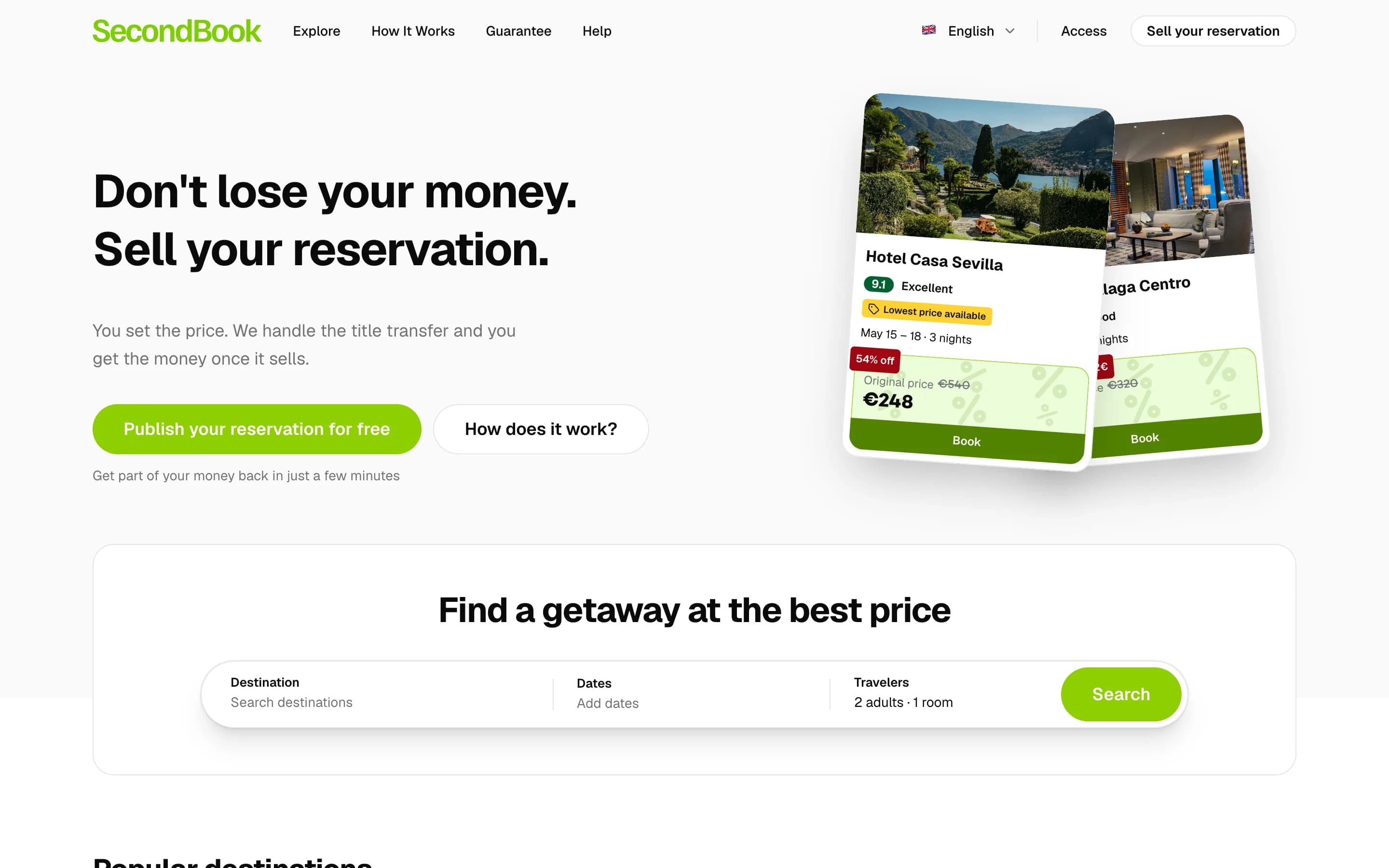
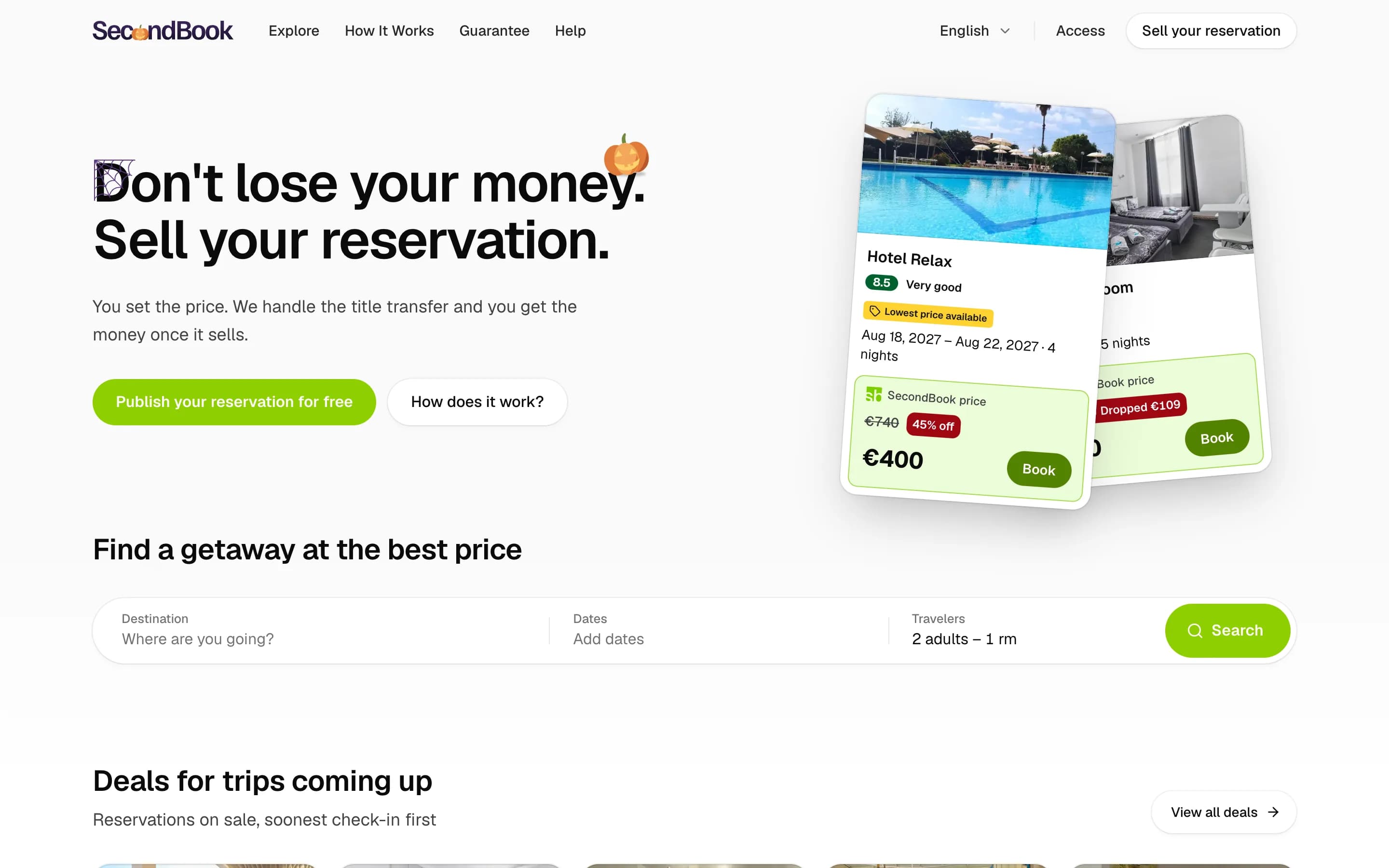
Three numbers and one rule
A marketplace like this one has three numbers that matter. Listings: how many people put a booking up for sale. Sales: how many of those a buyer actually books. Returns: how often someone comes back, because a booking that fits your dates may show up next week. The fourth goal is not a number but makes the other three easier: the site should feel made for the person looking at it, in their language (it speaks eight), with their holidays and their dates.
Every change in the redesign maps onto one of them.
One system, applied everywhere
Before any of that, the site needed to look like one product. The old one had grown page by page, and you could tell. Buttons came in several shapes, shadows changed from card to card, and loading states were a mix of spinners and blank boxes.
We have a design system: written rules with exact values for surfaces, shadows, radii, type, motion and copy. With Claude we applied it to every page of the site, one page at a time, checking each against the rules. The colours are in OKLCH, and every raised surface uses one of a few shadow tokens. A shadow is a hairline ring plus soft layers, instead of a grey border:
--elevation-border: 0 0 0 1px #0000000f;
--elevation-card: 0 0 0 1px #0000000f, 0 1px 2px -1px #0000000f, 0 2px 4px 0 #0000000a;
--elevation-raised: 0 0 0 1px #0000000f, 0 2px 6px -1px #00000014, 0 6px 16px -4px #0000001a;
--elevation-popover: 0 0 0 1px #0000000f, 0 4px 8px -2px #0000000d, 0 16px 32px -8px #0000001f;
Dark mode redefines the same four tokens, so no component needs a dark: variant for its shadow.
One rule changed the most screens: no spinners. A button that's working keeps its colour, goes quiet and says what it's doing: the payment button reads "Paying…". A page that's loading shows a skeleton with the shape of what's coming. That matters more here than on most sites. A buyer is paying for a stranger's booking, and a spinning circle during a payment is a moment to doubt. A button that says what it's doing is a moment to wait.
The deals come first
The old home opened with a search box and a grid of destination photos. The bookings for sale came after them. That order sold destinations. Secondbook's product is the bookings, so the new home puts them right under the search, soonest check-in first:
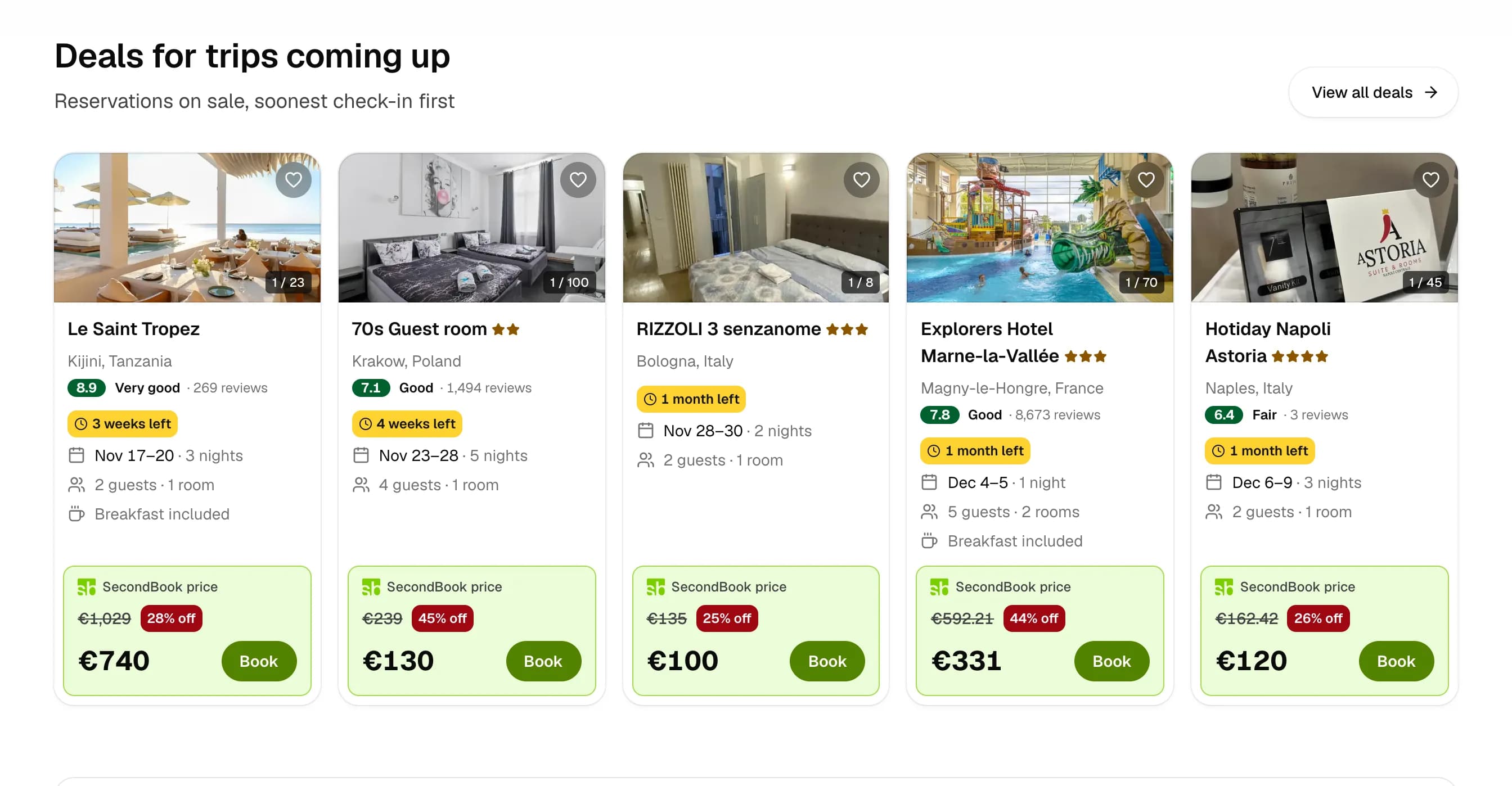
Each card answers, in order, the questions a buyer has before pressing Book:
- Is the hotel any good: the rating, its word and the number of reviews behind it ("7.1 Good · 1,494 reviews").
- How long do I have: a yellow chip with the time left before check-in. This urgency is real. A booking that hasn't sold by its check-in date is worth nothing to anyone, so the chip shows the deadline the listing actually has.
- Does it fit me: dates and nights, guests and rooms, and breakfast when it's included.
- What do I save: the price box. The hotel's price struck through, the discount in red, Secondbook's price large, and Book inside the same box, so the eye ends where the action is.
The green box is the one piece of brand colour on the card. Everything else is grey type on white. On a page full of cards, that's what lets a buyer compare prices down a column without reading anything else.
A calculator for the seller
The other side of the marketplace is the person with a booking they won't use. Before they list it, they want to know one thing: how much of their money comes back. The home now answers that directly:
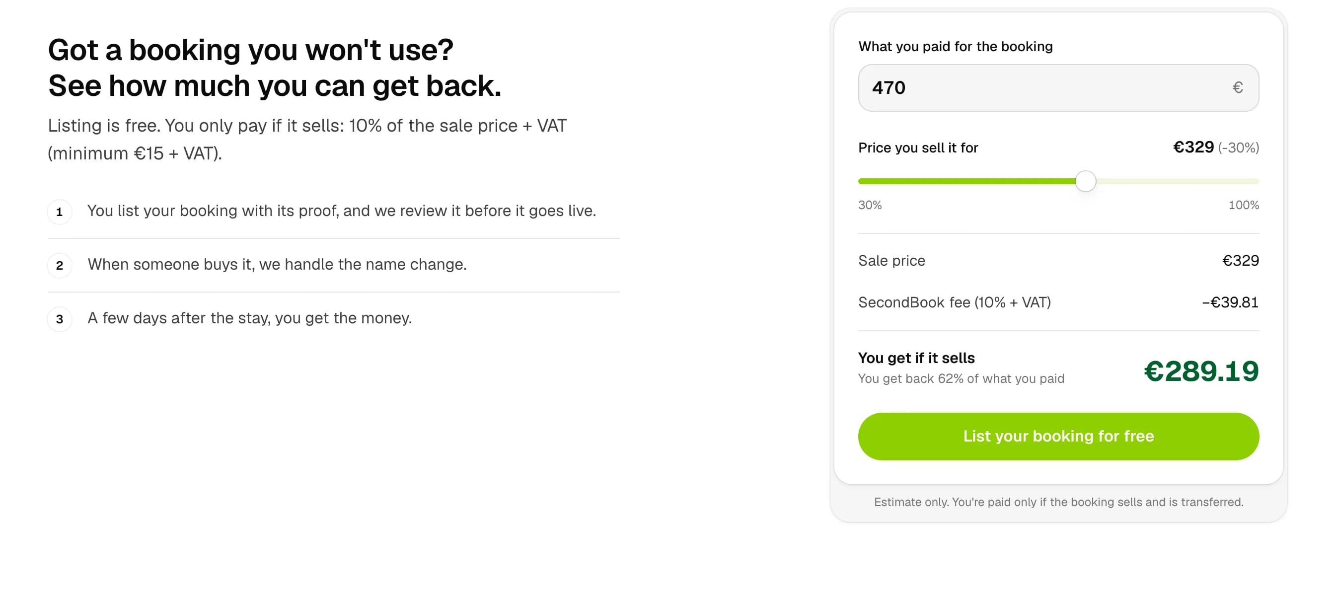
You type what you paid, drag the price, and see the fee and what you'd receive, with the share of your money you'd get back. The fee line spells out the 10% plus VAT, because a seller who discovers a fee at the end feels tricked, and one who sees it first can decide. The amounts travel in the URL, through sign-in and into the listing form, so the number the seller saw on the home is the number waiting in the form.
Two quieter features work on the same number after the booking is listed. With dynamic pricing, the seller says how far the price may fall, and it drops on its own 30, 15, 7, 3 and 1 days before check-in: small steps early, bigger ones near the date. And a seller whose booking hasn't sold gets an email suggesting a lower price 15, 7 and 1 days before check-in. A booking that sells for less is still revenue. One that doesn't sell is nothing.
A logo that knows the date
This is the part that looks least like business, and the part I'm proudest of.
On a special day the Secondbook logo redraws itself. Press it and it plays again:
The calendar behind it has 159 events, from national holidays to shopping days and travel seasons, across 96 countries. Each visitor gets the calendar of their own market, read from their account's country, then their IP, then the site's language. A market can be narrower than a country: Madrid's own fiestas sit on top of Spain's days and the ones every European gets. The doodle is one drawing per event, and the big travel seasons get a version per region, because "holiday trips" means snow in Germany and a beach in Brazil:
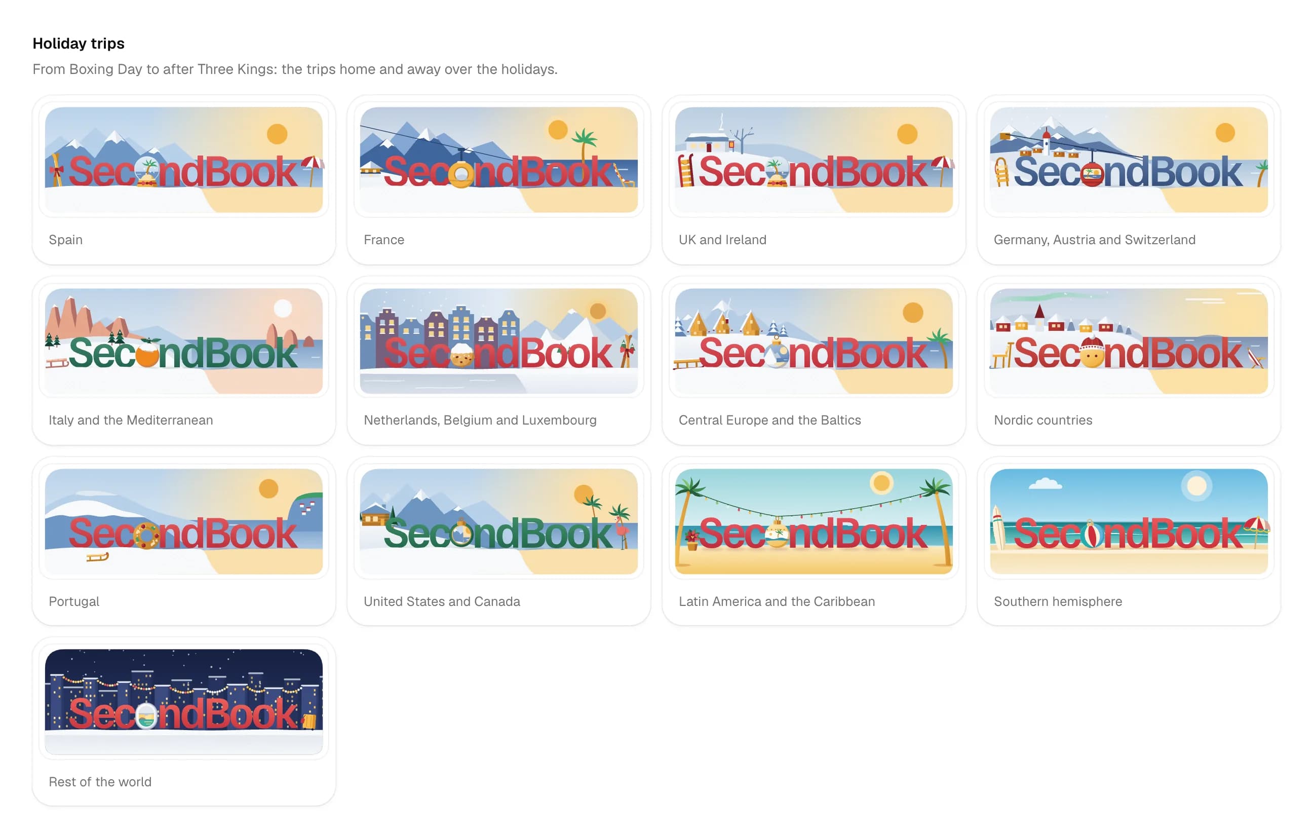
The full doodles are small scenes, and every piece in them moves with the same physics as the logo: pieces drop and swing on a thread, and the motion stops once and rests on its last frame. Nothing loops on the page.
The business reason is the offers page. Long weekends and holidays are when people travel, and also when plans fall through: buyers and sellers both gather around those dates. The doodle tells a visitor that a date is coming, and the offers page turns that into a search:
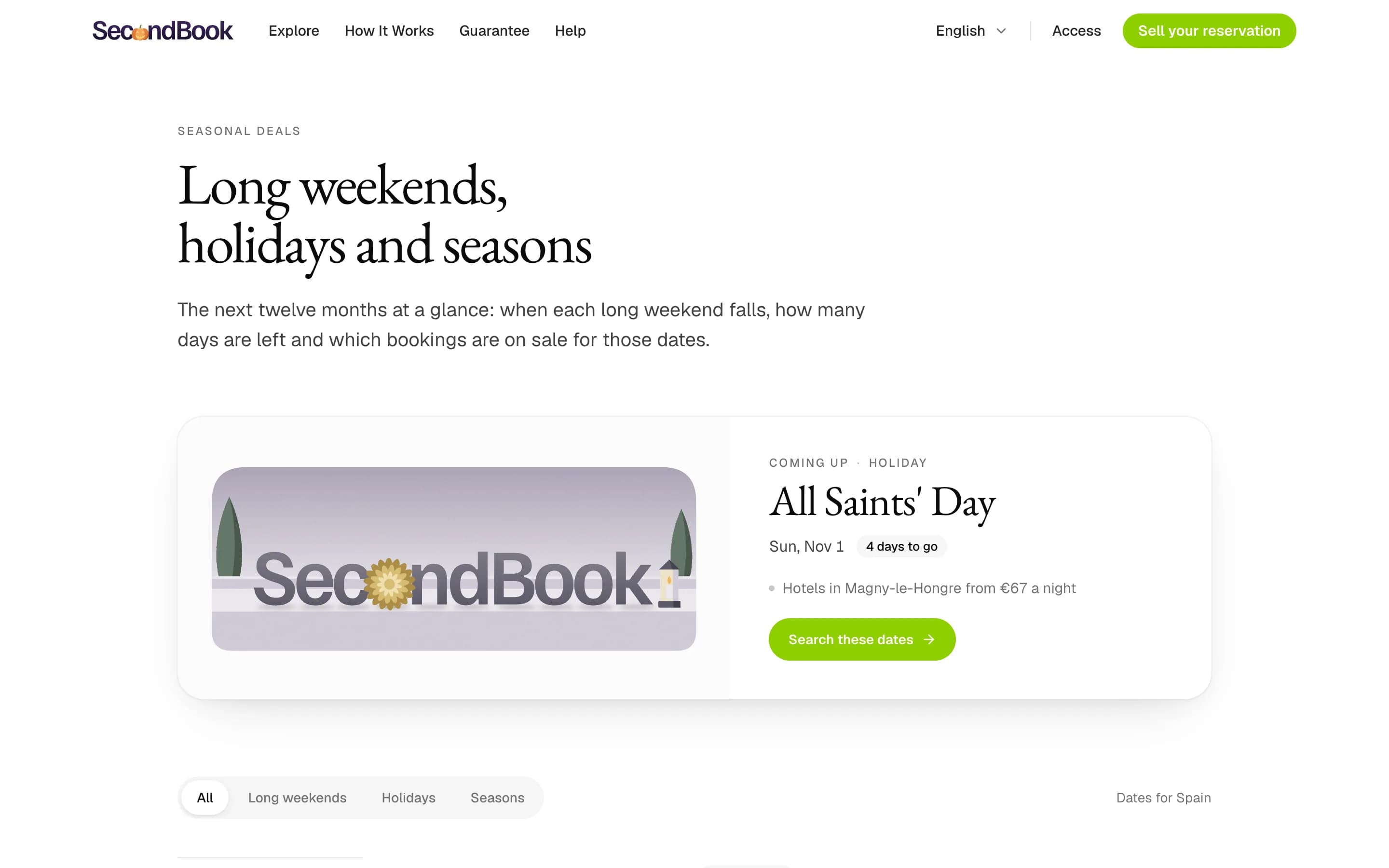
The decoration is also something the visitor controls. A setting turns every seasonal look off, and another lets a traveller follow a different country's calendar, so someone from Mexico living in Spain can keep Día de Muertos. On solemn days the doodle stays still.
A like worth pressing
A like on a hotel is a promise to come back. Secondbook keeps that promise with an email. When a saved hotel's price drops (for example through dynamic pricing), the buyer gets one email with every drop at once, the old price next to the new one. So the like is the first step of a return visit, and it's worth making people want to press it.
Press it:
The everyday like lasts one second. The outline heart squashes, a disc swells and hollows into a ring, and through the ring the heart pops out turning into Secondbook's own symbol. It holds the symbol for a moment, tilts, and turns back into a heart as seven pairs of dots fly out and fade from lime to amber. The timing is written down as plain numbers:
const LIKE_MS = 1000;
const UNLIKE_MS = 200;
/** Heart → SB while it pops through the ring; SB held; SB → heart. */
const MORPH_IN = [260, 440] as const;
const MORPH_OUT = [760, 900] as const;
/** Seven pairs of dots, like X's: a bigger one and, a little behind and further round, a smaller one. */
const PAIRS = 7;
The unlike is the opposite on purpose: 200 milliseconds, no burst. Saving is the moment to celebrate, removing should get out of the way.
On a special day the heart turns into that day's emblem instead, with its own particles and timing: a pumpkin with bats, a tree in snow, a price tag that spins like a coin on Black Friday. There are 142 of these, one per event that has a look. Two rules keep it from becoming noise. The like only plays when someone presses it, never on hover and never on scroll, and with reduced motion it simply fills.
A guide for every destination
Secondbook writes a travel guide for each destination, and each guide is a book. The redesign gave them a cover system instead of a cover: a destination, a subtitle, a photo and a seed go in, and the same cover comes out every time, in one of 24 publisher styles. Here are five guides in seven of those styles. Pick a guide, then another style, and the same guide is drawn again under that style's rules.
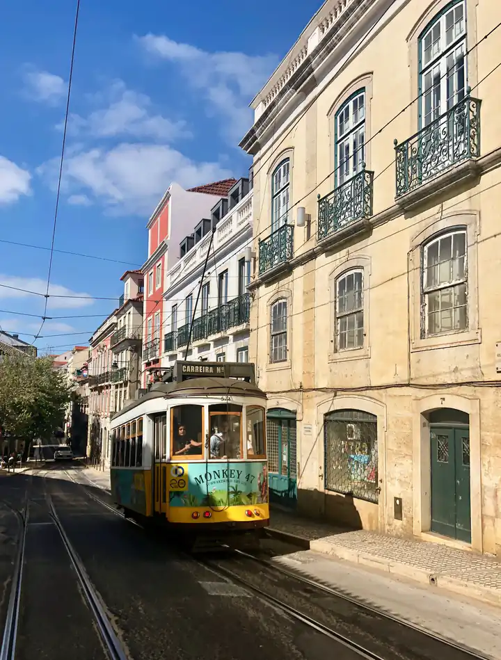
Lisbon
Seven hills and a river
Portrait. Full-bleed photo with the name huge at the top.
A guide opens in the style Secondbook's brand page shows it in.
The styles behave like a publisher's series, not like templates:
- Each one has its own rules: Portrait sets the name huge over a full-bleed photo, Frame hangs the photo like a museum piece, Engraving turns the landmark into fine lines printed in the board's colours.
- The type fits itself: the title is measured against the cover's width, so "Iceland" and "The Alhambra and the Albaicín" both sit right without anyone setting a size.
- The photo picks the ink: a title set over a photo reads the photo's tone and chooses gold, cream or dark so it never disappears into the sky.
The business reason is coverage. A guide is a page Google can find for a destination, and inside it, blocks of current deals link to the hotels on sale there. Nobody has to design a cover for a new destination: it gets one the moment its guide exists, so the guides can grow as fast as the listings do. The 3D book they stand in has its own post.
A postcard for every destination
The last piece is the one people share. Every destination can also be drawn as a vintage postcard, in six styles, with a handwritten note, a stamp and a postmark on the back.
Barcelona
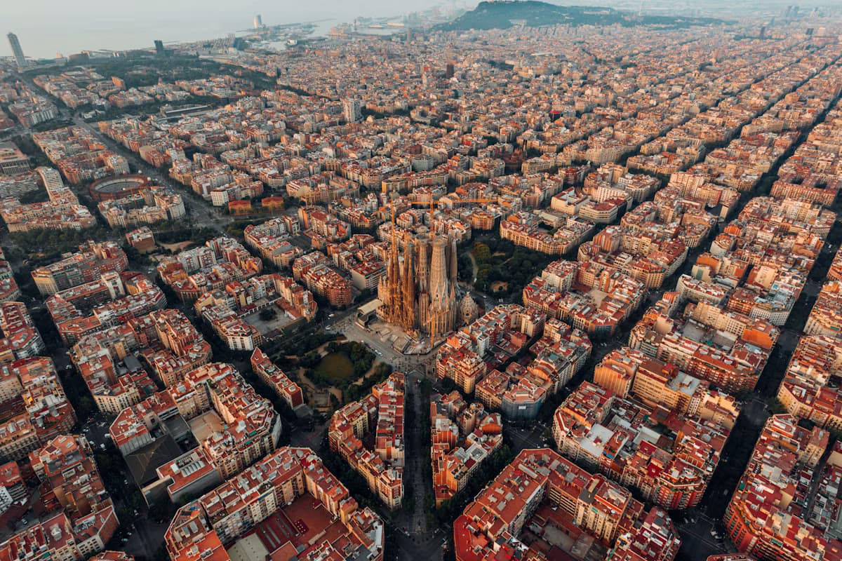
Big letters with the photo inside, like the classic greetings from the seaside.
A few decisions that are easy to miss:
- The sky comes from the photo: the card reads the photo's own colours on a small canvas and paints the background and inks from them, so Paris and Barcelona never share a palette.
- It's cut from card stock: the edge is slightly uneven, and when it turns you see its thickness, a 4px edge a shade darker than the face.
- The logo is pressed into the card: raised on the front, at a spot where it doesn't touch any text, and sunk at the same spot on the back.
The business reason is reach. The same component, with no copy of its code, draws the card on the web, the server route that renders it as an image, and the postcards in Secondbook's video studio. There the back of the card carries a real offer: the hotel, its stars, the dates, the price with the original struck through. The studio renders them as vertical, square or landscape videos for Reels, TikTok and feeds. A postcard drawn once becomes marketing material for every offer, at no extra cost per offer.
What the numbers will say
The redesign shipped a few hours ago, so there are no before and after figures yet, and I won't pretend otherwise. What there is, is a way to get them. Every internal link on the new site carries the name of the block it sits in and its position, and every page view records how the visitor arrived. When someone presses "Search these dates" under a doodle, or a deal card in the third slot of the home, the analytics know. Each listing also counts its views and clicks per day, so a price drop can be read against the visits it brought.
That's the trade I made. The design work in this redesign is the most I've put into anything: a drawing for every holiday in 96 countries, a like with 142 versions, postcards that read the sky from a photo. None of it was allowed in for being pretty. Each piece had to point at a listing, a sale or a return visit, and from today each one is measured against the number it pointed at.
Credits
Related articles
Google says to review every AI-written page by hand. I'm building a loop that won't: it reads my analytics, edits my sites and measures what worked.
Same site, same 28 days: 229 visitors, 30,121 visits, 7 clicks. How one command joins five analytics tools into a weekly report, critical first.